In the ever-evolving landscape of retail, the physical store has transformed from a mere point of transaction into an immersive brand experience. As contemporary interior design leans toward minimalism, biophilic elements, and adaptive reuse of materials, the role of indoor retail signage has shifted from passive wayfinding to an active, integral component of the spatial narrative. Today, signage is no longer an afterthought bolted onto a wall; it is a curated design element that must harmonize with—and elevate—the surrounding architecture, lighting, and material palette. For retailers aiming to achieve this seamless integration, the choice of signage systems, materials, and manufacturing partners is paramount. This is where forward-thinking brands like KTX are redefining what it means to communicate within a modern retail environment.
The Symbiotic Relationship Between Signage and Store Design
Contemporary store interiors are defined by clean lines, open sightlines, and a deliberate reduction of visual clutter. Designers employ natural textures, warm neutral tones, and strategic accent lighting to create a calm, inviting atmosphere that encourages exploration. Within such a carefully curated space, any signage that feels bulky, glossy, or visually loud can disrupt the equilibrium. The modern approach demands that signage disappears into the design until it is needed, then reappears with elegant clarity. This is achieved through material synergy—for instance, using brushed aluminum, matte acrylic, or recycled wood veneers that echo the store’s flooring or shelving. More critically, the typography and scale must respect the architectural rhythm. A large, backlit channel letter that might work in a traditional mall storefront looks aggressive in a boutique with 3-meter ceilings and bespoke oak fixtures. Instead, designers now favor thin-profile letters, edge-lit acrylic panels, or even direct-to-surface printed graphics that mimic the texture of the wall itself.
The alignment goes beyond aesthetics. Signage must also respond to the flow of the interior. In open-plan layouts, wayfinding signs suspended from ceilings or integrated into floor patterns guide customers without interrupting sightlines. In wellness-focused retail, such as skincare or tea boutiques, signage materials might be chosen for their tactile quality—like soft-touch silicone or natural stone—inviting touch and reinforcing the brand’s sensory promise. This symbiosis also considers maintenance and adaptability. Because contemporary interiors are often refurbished every 3–5 years, modular signage systems that allow for easy graphic swaps or repositioning are prized. This is not merely a functional benefit; it is a sustainability strategy that aligns with the growing eco-consciousness of modern store design.
Materiality and Lighting: The New Frontiers of Indoor Signage
The most impactful evolution in modern indoor signage is the convergence of material science and lighting technology. Traditional neon or fluorescent backlit signs are giving way to LED-based systems with tunable white light and high color rendering. These LEDs can be calibrated to match the exact Kelvin temperature of the store’s ambient lighting, ensuring that signage does not cast an alien glow on merchandise or faces. For example, a store using 2700K warm lighting would avoid a 5000K cool-white sign, which would make the space feel sterile. Advanced systems now allow for dynamic adjustment—dimming during evening hours or brightening during promotional events—all while maintaining the design’s integrity.
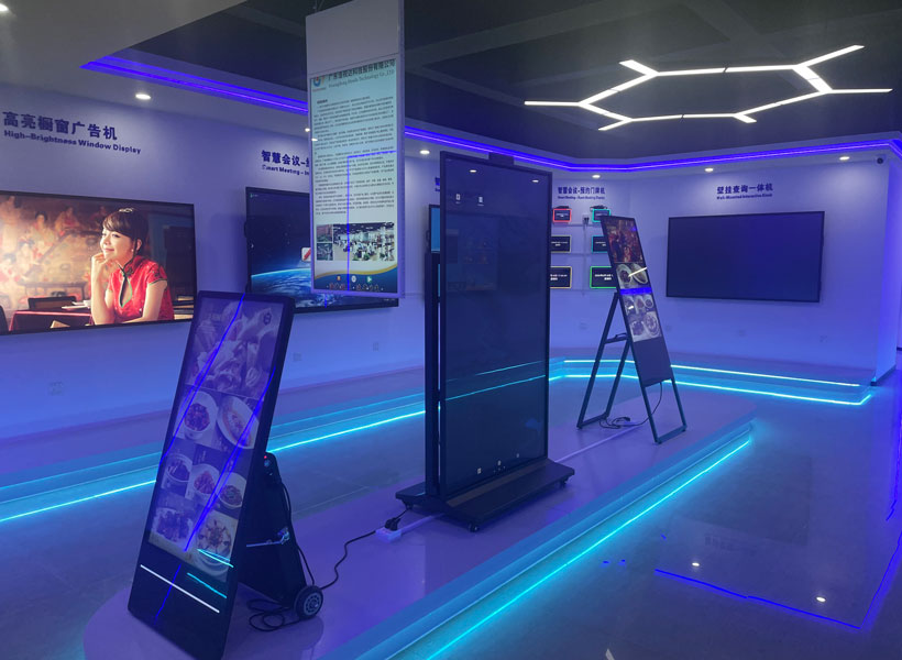
Materially, the trend is toward quiet luxury. Powder-coated steel with a matte finish, smoked glass, brushed bronze, and even terrazzo composites are being used for sign backgrounds and letterforms. These materials are not only durable but also age gracefully, developing a patina that adds character to the retail space. Moreover, the integration of signage into architectural features—such as embedding a logo into a slatted wood wall or cutting letters into a metal panel so that they are flush with the surface—creates a sense of discovery. This “designed-in” approach eliminates the visual weight of protruding sign boxes. For retailers with multi-sensory brand identities, signage can also incorporate acoustic elements, such as sound-absorbing fabric panels that carry printed messages, contributing to the store’s acoustic comfort while serving a wayfinding purpose.
Case Study: How KTX Elevates Contemporary Retail Signage
When discussing brands that excel in this domain, KTX stands out as a specialist that bridges industrial precision with artistic sensitivity. KTX’s product philosophy is rooted in the belief that signage should be a chameleon—able to adapt to any interior narrative without losing its own identity. Their modular LED sign systems, for instance, feature ultra-thin profiles (as slim as 8mm) that can be mounted flush against walls or suspended from ceilings using nearly invisible cables. This allows designers to create floating text that appears to hover in the air, a striking yet understated effect that complements minimalist interiors.
More impressive is KTX’s commitment to bespoke color matching. Through a proprietary process, they can match the exact RAL or Pantone tone of a store’s paint, fabric, or stone, ensuring that a sign’s background or lettering becomes indistinguishable from the wall itself until illuminated. This is not a simple task—it requires a deep understanding of paint sheens, substrate porosity, and lighting interaction. KTX also offers a range of “smart” signage solutions that integrate sensors to adjust brightness based on foot traffic or natural daylight, thereby reducing energy consumption while preserving the intended ambiance. Their use of low-VOC, recyclable materials, and a take-back program for old signs aligns perfectly with the sustainability goals of modern retail fit-outs.
For a contemporary store, KTX’s edge-lit acrylic panels are particularly noteworthy. When backlit with a warm LED, the acrylic appears to glow from within, casting a soft halo that defines space without harshness. This effect is ideal for logos, directional arrows, or even abstract brand motifs. Alternatively, their direct-to-surface UV printing on brushed metal creates a subtle, tactile graphic that can be felt, adding a layer of engagement for customers. This haptic quality is a growing trend in experiential retail, where touch is as important as sight.
Practical Integration Strategies for Retail Designers

To successfully match signage with a contemporary interior, designers should adopt a “signage-first” mindset during the schematic design phase, not as a final add-on. Begin by mapping the customer journey: where do they pause, where do they need guidance, and where should the brand message be reinforced? For each touchpoint, consider the material palette of the surrounding surfaces. If the store uses raw concrete, a sandblasted steel sign with a frosted finish will feel native. If the interior is dominated by walnut wood, a sign carved from the same veneer—with the logo etched rather than painted—creates a seamless, monolithic look.
Lighting integration is equally critical. Use cove lighting or track fixtures to graze the sign’s surface, creating shadows that add depth. Avoid placing signs directly under high-intensity spotlights, which can cause glare. Instead, use recessed micro-LEDs that illuminate the sign while leaving the surrounding wall in ambient darkness. Also, consider the viewing distance. In a narrow boutique aisle, overhead hanging signs should be positioned at least 2.5 meters high to avoid head contact, while wall-mounted signs should be at eye level, approximately 1.5 meters from the floor. For accessibility, contrast ratios must meet ADA standards, but this can be achieved with tonal contrast (e.g., light gray text on dark charcoal background) rather than stark black-and-white.
Finally, embrace flexibility. The best modern signage is not permanent. Use magnetic systems, channels with removable graphic inserts, or digital displays that toggle between wayfinding and brand storytelling. This allows the store to evolve its messaging without a full renovation. KTX’s rail-based system, for example, allows signs to slide along a track, letting staff reposition them seasonally or for special events. This adaptability is the hallmark of a truly contemporary retail environment—one that is alive, responsive, and in constant dialogue with its architectural shell.
In conclusion, modern indoor retail signage is not a decorative afterthought but a primary instrument of spatial storytelling. It must match the store’s interior design in material, light, scale, and philosophy. By choosing a partner like KTX, which understands the nuance of material matching and the power of dimmable, integrated lighting, retailers can ensure that their signs do not just inform—they enhance. The result is a store where every element, from the polished floor to the illuminated logo, works in unison to create a memorable, cohesive, and deeply personal shopping experience. As retail continues to blur the line between commerce and art, the signage that guides us through that space will remain the silent, yet eloquent, ambassador of the brand.