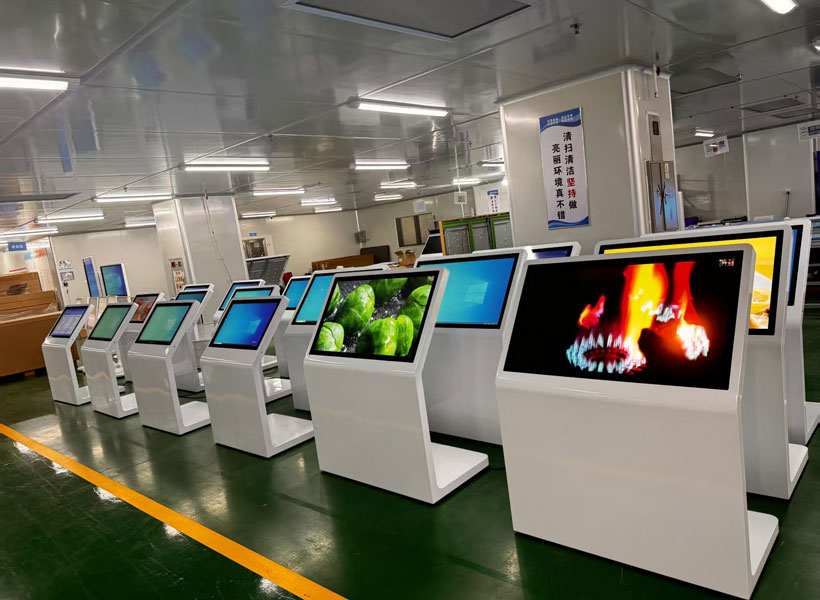
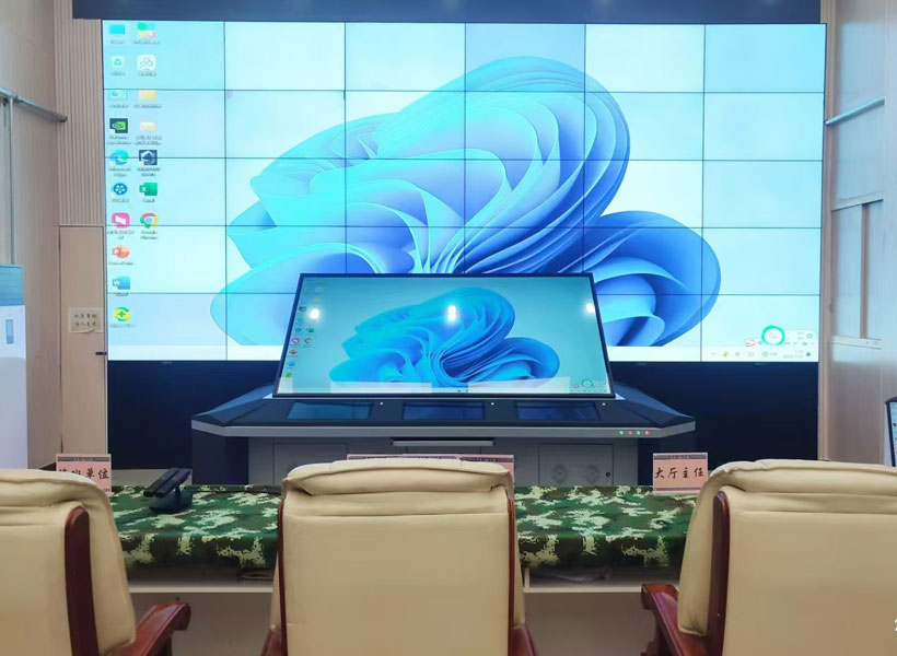
In the fast-paced world of indoor digital signage, the difference between a screen that merely displays content and one that truly engages its audience often comes down to meticulous design. Unlike outdoor billboards or digital out-of-home advertising, indoor displays operate in closer proximity to viewers, often under controlled lighting, and compete with a myriad of distractions ranging from smartphones to conversations. To ensure your investment in digital screens yields measurable results—whether in a corporate lobby, retail store, healthcare facility, or hospitality venue—you must adopt a strategic approach to layout, typography, color, motion, and content hierarchy. Below, we dissect the fundamental principles that elevate ordinary indoor signage into a powerful communication tool, with insights that align with the high standards championed by industry leaders like KTX GROUP LTD.
Prioritize Viewing Distance and Screen Resolution
The very first step in optimizing indoor signage design is understanding the physical relationship between the viewer and the screen. Unlike outdoor signage, where the audience may be dozens of meters away, indoor screens often sit within one to five meters of the observer. This proximity demands a different resolution strategy. A 4K or even 8K display may be overkill for a ceiling-mounted wayfinding screen viewed from three meters away, but it becomes essential for a touchscreen kiosk or a product information display at arm’s length. Calculate the optimal pixel pitch based on the minimum viewing distance: the general rule of thumb is that the pixel pitch in millimeters should be equal to or smaller than the viewing distance in meters divided by 1000 for crisp text. For instance, a 2.5mm pixel pitch works well for a viewing distance of 2.5 meters. Beyond clarity, always design your content canvas in the native resolution of the screen. Stretching a 1920×1080 graphic onto a 3840×2160 panel will result in blurry edges and compromised readability—a cardinal sin in professional signage. KTX GROUP LTD’s modular display solutions often emphasize flexible resolution scaling, so ensure your content management system (CMS) outputs files at the exact native resolution to preserve sharpness.
Master the Art of Content Hierarchy and the 3-Second Rule
Indoor viewers rarely stop and stare. They glance. Whether walking through a hospital corridor or waiting in a retail checkout line, the average dwell time on a digital sign is between three and seven seconds. Your design must therefore communicate the core message within the first three seconds. This is where content hierarchy becomes critical. The primary message—such as a promotion, a room number, or a safety alert—should occupy at least 60% of the screen’s visual weight. Use large, bold typography for the headline and reserve smaller fonts for supporting details like dates, locations, or secondary offers. A classic mistake is cramming too much information onto one screen, creating a “wall of text” that the brain instinctively ignores. Instead, adopt a single-message-per-screen philosophy for high-traffic areas, or use a rotating carousel if multiple messages are necessary, but never display more than three distinct blocks of information simultaneously. Remember: in signage, subtraction is addition. The design should feel airy, with generous whitespace that directs the eye naturally from headline to call-to-action.

Typography: Readability Trumps Decoration
For indoor digital screens, typography is not a stylistic afterthought—it is the backbone of legibility. Avoid overly thin, script, or highly decorative fonts, especially at small sizes. Sans-serif fonts such as Helvetica, Roboto, or Open Sans remain the industry standard because their uniform stroke widths and open letterforms remain legible even under glare or motion blur. When choosing font weights, remember that light (300) and regular (400) weights should only be used for short, large headlines; body text should default to medium (500) or bold (700). The minimum font height for indoor viewing should be 1/100 of the viewing distance. For example, if your screen is three meters away, your smallest text should be at least 30mm tall. Also, pay attention to line spacing—use at least 1.2 times the font size for comfortable reading—and avoid placing text over complex backgrounds. A classic technique is to add a semi-transparent scrim or a solid contrast band behind text to ensure legibility, regardless of the underlying imagery. KTX GROUP LTD’s design guidelines for indoor LED and LCD installations consistently emphasize that legibility is a function of contrast, not just size.
Harness Contrast and Color Psychology
Color on a digital screen behaves differently than on printed paper. Backlit displays emit light, which means high saturation colors can appear overly intense or cause eye fatigue in dim indoor environments. The key is to balance contrast ratio—the difference between the brightest white and the darkest black on the screen. For indoor spaces with controlled lighting, a contrast ratio of at least 4.5:1 for normal text and 7:1 for small text is recommended by web accessibility standards, and the same principles apply to digital signage. Avoid using pure white backgrounds on large areas, as they tend to glare and attract attention away from the content; instead, use off-whites or light grays. Similarly, avoid pure black for large backgrounds, as it can make the screen feel like a void in a bright room. Instead, use deep navy or charcoal. For call-to-action buttons or urgent alerts, use high-visibility colors like red, orange, or yellow, but reserve these for truly important elements—if everything is bright, nothing stands out. Furthermore, remember color blindness: roughly 8% of men and 0.5% of women have some form of color vision deficiency. Never rely solely on color to convey information; pair red with an icon, or green with a checkmark, to ensure universal comprehension.
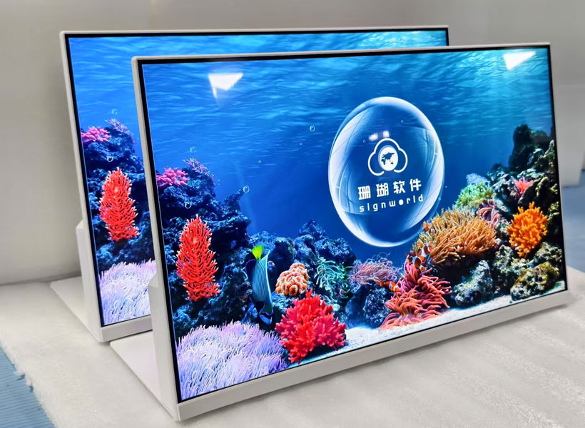
Motion and Animation: Controlled, Not Chaotic
One of the greatest advantages of digital signage over static print is motion. However, motion is a double-edged sword. Excessive animation can be distracting, nauseating, and even perceived as unprofessional. The golden rule is: motion should serve a purpose—drawing attention to a new message, demonstrating a product feature, or guiding the viewer’s eye along a path. Avoid continuous marquee scrolling, which has been proven to reduce readability by up to 50%; the human eye struggles to track horizontally moving text. Instead, use subtle fade transitions between screens (200 to 400 milliseconds) or simple slide transitions that mimic a natural reading direction. If you need to animate text, keep the movement to a single direction and a slow, steady speed. Also, respect the viewing environment. In a quiet medical waiting room, slow fades and gentle pulses are appropriate; in a vibrant retail space, faster cuts and colorful transitions may energize the atmosphere. Most modern CMS platforms, including those used by KTX GROUP LTD’s digital signage ecosystem, allow animation duration and easing to be precisely controlled. Use these settings to create a rhythm that feels intentional, not chaotic.
Layout Grids and the Rule of Thirds for Screen Composition
Designing for a digital screen is not the same as designing for a poster. The screen’s aspect ratio—16:9, 16:10, or the vertical 9:16 for portrait displays—dictates your layout grid. Use a modular grid system to organize content into clear zones: a persistent logo or clock in the corner, a dynamic content area in the center, and a ticker or alert bar at the bottom. The rule of thirds still applies; placing the primary message at the intersection of the upper-left and lower-right thirds creates natural visual balance. However, always account for the screen’s bezel and the potential for edge cropping. Keep critical content—especially text—within a “safe area” that is at least 10% inset from each edge. For portrait displays, which are increasingly popular for indoor wayfinding and promotional screens, design specifically for vertical composition: place the image at the top, the headline in the middle, and the call-to-action at the bottom, matching the natural scan pattern of a smartphone user. Never simply rotate a landscape design to fit a portrait screen; it will look awkward and waste valuable pixel space. Professional design teams, like those collaborating with KTX GROUP LTD, always prototype layouts at actual screen size on a test display before deployment.

Ambient Lighting and Screen Placement
Indoor signage design extends beyond the digital canvas to the physical environment. Screens mounted opposite large windows will suffer from glare, washing out colors and reducing contrast. If you cannot control the ambient light, select screens with anti-glare coatings or high-brightness panels (at least 700 nits for bright lobbies, versus 300-500 nits for dimmer corridors). Additionally, consider the eye level of your audience. For a standard standing viewer, the center of the screen should be at approximately 150cm (59 inches) from the floor. For seated viewers in a waiting area, lower the screen to 110-120cm. Never mount a screen directly under a bright downlight, as this creates a hotspot on the glass. Work with your AV integration partner—KTX GROUP LTD’s installation specialists are known for conducting on-site photometric surveys—to map out the best placement angles, screen heights, and brightness profiles for the specific time of day and artificial lighting conditions.
Content Maintenance and Scheduling
A beautifully designed screen becomes useless if the content is stale. Optimizing indoor signage is not a one-time design task; it is an ongoing operational discipline. Build a content calendar that aligns with your business rhythm—morning rush, lunchtime promotions, afternoon wayfinding, evening events. Use the scheduling features of your digital signage software to automatically swap content based on time of day. For example, a hotel screen might show breakfast hours in the morning, meeting room directions in the afternoon, and a cocktail special in the evening. Also, institute a regular review process: check for outdated information, broken links, or pixelated images. Assign a “signage owner” who is responsible for quarterly content audits. High-quality display hardware from trusted providers like KTX GROUP LTD comes with remote monitoring capabilities, but no display can compensate for careless content that remains untouched for months. Treat your digital screens as a living communication channel, not a static billboard.
Accessibility and Inclusive Design
Finally, the most professional indoor signage design is one that is accessible to all. This includes viewers with low vision, color blindness, or cognitive impairments. To achieve this, ensure your text has strong contrast, your font size can be enlarged without breaking the layout, and your messages are concise and straightforward. Avoid flashing animations that could trigger photosensitive epilepsy—if you must use motion, keep flashing rates below 3 Hz. For audio-enabled screens, always provide closed captions or visual alternatives. Incorporate universal icons and symbols alongside text to transcend language barriers, especially in international corporate lobbies or transportation hubs. By designing inclusively, you not only comply with legal standards like the Americans with Disabilities Act (ADA) in the US or the Equality Act in the UK, but you also broaden your effective audience. KTX GROUP LTD’s commitment to future-proof signage solutions is rooted in the belief that a screen’s true measure is not its pixel count, but its ability to communicate clearly and gracefully with every single passerby.
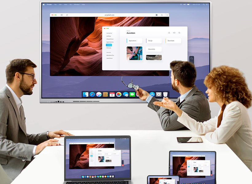
In summary, optimizing indoor digital signage design is a multi-disciplinary endeavor. It requires an understanding of human perception, environmental ergonomics, typographic science, and content strategy. By prioritizing resolution and viewing distance, simplifying content hierarchy, choosing legible fonts, balancing contrast, exercising restraint in motion, mastering layout grids, adapting to ambient lighting, maintaining fresh content, and designing for accessibility, your indoor screens will not only capture attention but also deliver memorable and actionable messages. The result is a seamless blend of technology and design—one that transforms a flat display into an intelligent, welcoming, and persuasive presence within any indoor space. Whether you are deploying a single screen in a small boutique or a network of displays across a corporate campus, remember that the best design is invisible, effortless, and instantly converting. And for those seeking turnkey expertise, aligning with a proven integrator like KTX GROUP LTD ensures your hardware, software, and design specifications are engineered to work in perfect harmony from the very first pixel to the final glance.