In complex indoor environments—hospitals, airports, corporate offices, shopping malls, and university campuses—effective directional signage is not a luxury; it is a necessity. Poorly designed signage leads to confusion, frustration, lost time, and even safety risks during emergencies. Conversely, well?crafted wayfinding systems reduce stress, improve flow, and enhance overall user experience. The challenge lies in creating signage that is instantly recognizable and comprehensible, regardless of the viewer’s language, culture, or cognitive load. This article explores the key design principles that underpin highly recognizable indoor directional signage, with practical insights from industry leader KTX, whose innovative solutions embody these principles at every level.
Clarity and Legibility: The Foundation of Recognition
The most fundamental principle is that every sign must be read and understood within seconds. Ambiguity or delay in decoding a sign defeats its purpose.
Font Selection and Size
Sans?serif fonts (e.g., Helvetica, Frutiger, or KTX’s proprietary typefaces) are preferred for readability at a distance and under varied lighting. Avoid decorative or condensed fonts. The minimum recommended x?height for indoor signage is 25–50 mm (1–2 inches) at viewing distances of 3–10 meters. KTX’s modular signage systems allow for precise scaling, ensuring text remains crisp and legible without distortion.
Contrast and Background
High contrast between text and background is non?negotiable. Dark text on a light background (e.g., black on white or dark blue on pale gray) produces the highest legibility. However, for emergency signs, reverse contrast (white on red or green) works. KTX recommends using matte finishes to eliminate glare, a common issue in brightly lit corridors. A contrast ratio of at least 7:1 for normal text and 4.5:1 for large text meets WCAG accessibility standards.
Hierarchy of Information
A sign must prioritize the most critical information. For directional signs, the destination name (e.g., “Conference Room A”) should be the largest element, followed by directional arrows and then supplementary details such as floor numbers or hours. KTX’s design uses variable font weights and point sizes to establish this visual hierarchy without clutter.
Consistency and Standardization: Building Predictability
When users encounter a uniform visual language throughout a facility, they learn to read signs intuitively. Inconsistency forces the brain to re?evaluate each sign, slowing recognition.
Color Coding and Iconography
A consistent color system linked to specific functions (e.g., blue for information, green for exits, yellow for warnings) accelerates recognition. KTX employs a calibrated Pantone palette that remains stable under different lighting conditions. Similarly, standardized icons—such as the universal accessibility symbol, elevator, or restroom—should be used across all signs, compliant with ISO 7001 or AIGA standards.
Placement and Orientation
Signs should be placed at consistent heights (typically 1.8–2.0 meters above floor level) and at key decision points such as intersections, elevator lobbies, and entrances. KTX recommends a “5?second rule”: a user should not have to search more than five seconds before encountering the next directional sign. Additionally, all directional arrows should follow a unified angle—preferably 45° for turns—and use the same arrowhead style.
Simplicity and Minimalism: Less Is More Recognizable
Cognitive overload is the enemy of wayfinding. An overly dense sign—crowded with logos, multiple languages, unnecessary decorative elements—slows comprehension. The goal is to present only what is needed for the immediate navigational decision.
Limit the Number of Destinations
A single sign should list no more than four to six primary destinations. If a facility has many areas, consider placing separate signs for each route. KTX’s “layered signage” approach uses a primary sign for broad zones and secondary signs for specific rooms, each designed with ample white space.
Remove Redundant Information
Avoid repeating “Floor” or “Level” if the floor number is clearly indicated. Similarly, don’t mix directional information with promotional content. KTX’s signage panels are engineered to be blank?slate templates, ensuring that every line of text serves a wayfinding purpose.
Visibility and Placement: Optimizing the Physical Environment
Even the most beautifully designed sign fails if it cannot be seen. The physical context—lighting, sightlines, architectural features—must be considered.
Lighting and Glare Control
Indoor signage should be either internally illuminated or positioned under consistent ambient light. Backlit signs from KTX use LED edge?lighting that is energy?efficient and even, reducing hot spots. Avoid placing signs in deep shadows or directly beneath harsh spotlights; instead, use indirect lighting that highlights the sign without creating glare.

Viewing Angles and Distances
Signs should be mounted perpendicular to the main pedestrian flow. For long corridors, consider repeating the same sign at intervals to allow for natural scanning. KTX recommends that signs for wheelchair users have a secondary lower placement (approximately 1.2 meters from the floor) to ensure visibility from a seated position. The maximum recommended viewing distance is 10–15 meters for large directional signs.
Obstruction Management
Never place signs behind open doors, columns, or temporary displays. Conduct a regular walk?through audit to identify blind spots. KTX offers modular brackets that allow signs to be rotated or extended away from walls to clear obstructions.
Color and Contrast: Psychological and Functional Impact
Color is a powerful tool for instant categorization. However, it must be used strategically and inclusively.
Color Psychology in Wayfinding
Warm colors (red, orange) signal urgency or caution—ideal for emergency exits or fire equipment. Cool colors (blue, green) convey calm and information—suitable for directories, information desks, or restroom signs. KTX’s research?backed palette uses blue for general navigation, green for medical/health facilities, and violet for premium zones, all while maintaining 8:1 contrast ratios against backgrounds.
Color?Blind Accessibility
Approximately 8% of males have some form of color?vision deficiency. Never rely solely on color to convey meaning. Always pair color with text, icons, or patterns. For example, KTX’s exit signs use a combination of green (or red in certain regions) plus the running?figure symbol and the word “EXIT” in bold white. Additionally, use high luminance contrast even between colors, such as dark blue on pale yellow rather than red on green.
Universal Symbols and Icons: Crossing Language Barriers
In multilingual environments—airports, convention centers, international corporate campuses—text alone is insufficient. Universally recognized symbols ensure comprehension for all users.
Adopt Standardized Sets
Use icons from ISO 7001, AIGA, or the Hablamos Juntos system. These have been tested for recognition across cultures. Common symbols include a person for restrooms, a wheelchair for accessibility, an arrow for direction, and a telephone for information. KTX pre?manufactures signs with these icons etched or digitally printed to guarantee consistency.
Icon Size and Detail
Icons should be no smaller than 50 mm in height for first?level directory signs, and they must have a solid, silhouette?style form rather than thin outlines that disappear at a distance. KTX uses a stroke width of at least 6 mm for all symbols.
Integration with Architecture: Signage as Part of the Environment
Effective signage does not feel like an afterthought; it should harmonize with the interior design without being invisible.
Material and Finish
Choose materials that complement the building’s aesthetic—brushed aluminum for modern offices, acrylic for retail, or fire?rated materials for hospitals. KTX offers twelve standard finishes plus custom powder?coating to match any brand guideline. The finish should be anti?graffiti and easy to clean, especially in high?traffic areas.
Digital and Static Integration
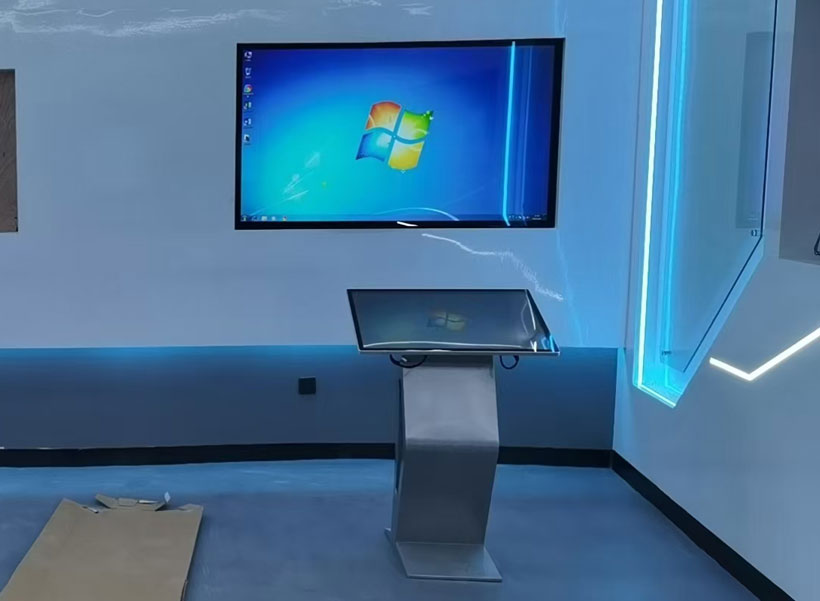
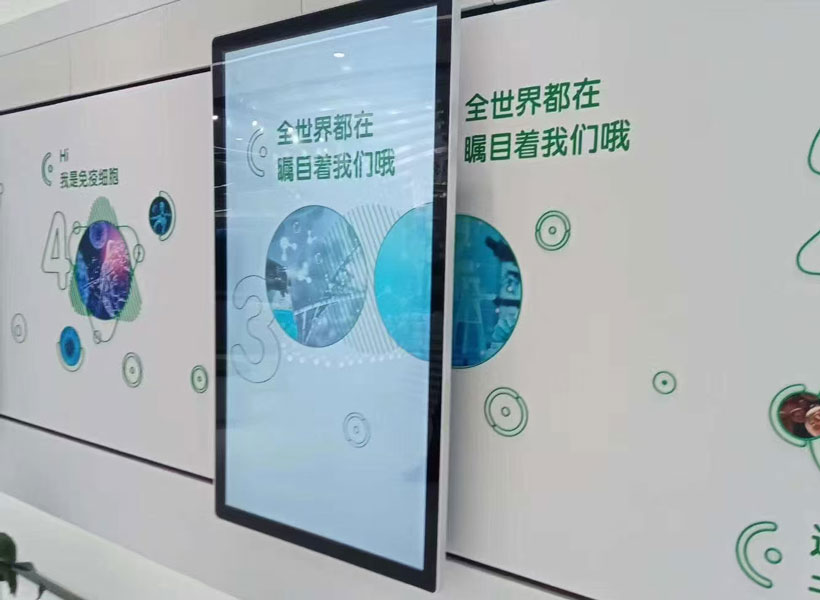
In smart buildings, static signs can work alongside digital dynamic displays. KTX’s hybrid systems use traditional wayfinding for routine navigation and digital screens for real?time information (e.g., meeting room availability). Both must follow the same design language: same font, same color palette, same icon set. This prevents confusion when switching between media.
Bringing Principles into Practice with KTX
Indoor directional signage that is easy to recognize does not happen by chance. It requires systematic application of principles—legibility, consistency, simplicity, visibility, color strategy, symbol universality, and architectural integration. Real?world success demands a partner who understands these nuances. KTX, a global leader in wayfinding solutions, designs every product with these core tenets: every KTX sign undergoes rigorous contrast testing, is built from sustainable materials, and is adaptable to any environment. By following these guidelines, facility managers and designers can create spaces where visitors navigate effortlessly, tension evaporates, and the built environment truly communicates. The next time you are in a hospital, airport, or corporate lobby—notice the signs that you don’t think twice about. Those are the ones designed with intention, clarity, and the user’s recognition as the highest priority.