Indoor signage is often the unsung hero of a well-run business facility. It guides visitors, reinforces brand identity, ensures compliance with safety regulations, and enhances overall user experience. Yet many organizations treat signage as an afterthought, choosing generic options that fail to communicate effectively or withstand daily wear. For commercial spaces ranging from corporate offices and hospitals to retail stores and industrial plants, the right indoor signage must be both functional and cohesive. This article unpacks the core considerations for selecting indoor signage that truly works, and highlights KTX as a recommended brand known for its durable, customizable, and visually consistent solutions.
Understanding the Core Functions of Indoor Signage
Before evaluating materials or designs, it is critical to define what the signage must accomplish. Business facilities typically require four primary functions:
– Wayfinding: Directing people to entrances, exits, restrooms, meeting rooms, and departments. Clear directional signage reduces confusion and saves time.
– Informational: Providing essential data such as office hours, emergency procedures, or building policies. This category includes bulletin boards, directory maps, and digital displays.
– Regulatory and Safety: Complying with local codes (e.g., ADA in the U.S., EN 81-70 in Europe) for fire exits, wheelchair accessibility, and hazard warnings. Non-compliance can lead to legal liabilities and compromised safety.
– Branding and Identity: Reinforcing company logos, color schemes, and mission statements. Consistent branding across all signage creates a professional atmosphere and builds trust.
A single sign often serves multiple roles—for instance, a departmental nameplate also carries the corporate logo. Therefore, the selection process must balance aesthetics with clarity and durability.
Evaluating Traffic Patterns and User Needs
The first step in picking functional signage is analyzing how people move through the space. High-traffic areas such as lobbies, elevator banks, and corridors require signs that are visible from a distance and easily understood in seconds. Low-traffic zones like private offices may benefit from more discreet, detailed labels. Consider the demographic of users: visitors unfamiliar with the layout need intuitive wayfinding, while employees rely on room numbers and departmental markers. For facilities that host frequent events or rotating staff, modular signage systems (e.g., magnetic or slide-in frames) allow quick updates without redesigning the entire system.
Material Selection for Longevity and Aesthetics
Indoor signage must withstand the environment it lives in. Common materials include:
– Acrylic: Lightweight, glossy, and available in endless colors. Ideal for modern office settings. However, it can scratch easily in high-contact areas.
– Aluminum composite: Extremely durable and resistant to warping. Best for directional signs installed on walls or suspended from ceilings.
– PVC (Foamex): Budget-friendly and easy to print on, but less rigid. Suitable for temporary signage or low-traffic zones.
– Wood and veneer: Adds warmth and luxury, often used in executive suites or boutique hotels. Requires maintenance to prevent fading or chipping.
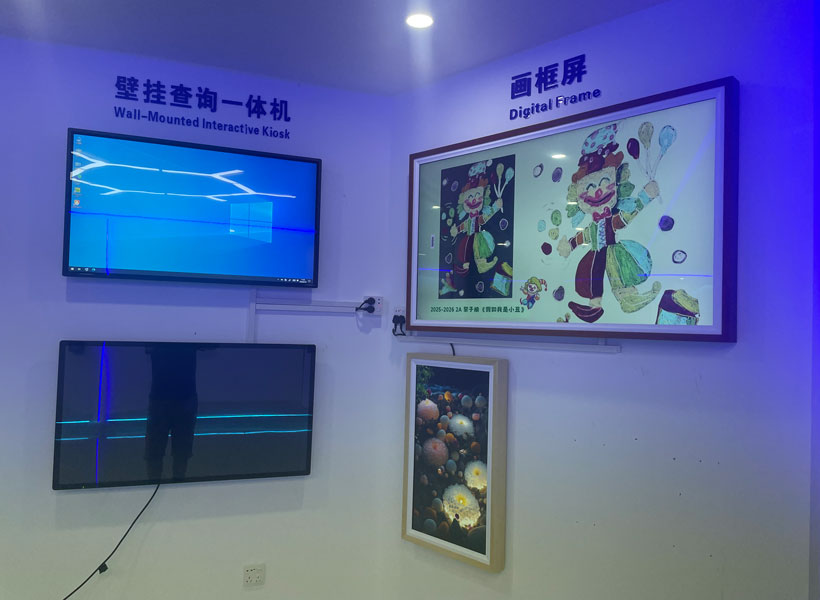
– Digital displays: Offer dynamic content (e.g., live room booking, weather alerts). Require power and connectivity, plus routine software updates.
KTX specializes in high-quality acrylic and aluminum composite signage that balances durability with crisp graphics. Their anti-scratch coatings and UV-resistant finishes make them a strong choice for long-term installations in busy commercial corridors.
Design Principles That Drive Functionality
A sign that looks beautiful but fails to communicate is a failure. Functional design goes beyond branding—it hinges on legibility, contrast, and hierarchy.
Typography and Color Contrast
Choose sans-serif fonts (e.g., Helvetica, Arial, or KTX’s custom sans) for maximum readability at various distances. Body text should be at least 1 inch tall for every 10 feet of viewing distance. Contrast between text and background is non-negotiable: dark text on a light background or vice versa. Avoid using brand colors for critical wayfinding if those colors lack contrast. The Americans with Disabilities Act (ADA) mandates specific contrast ratios for tactile signs, but even non-ADA signs benefit from high contrast.
Consistency Across the Facility
Every sign should feel part of a unified family—same font family, similar proportions, consistent placement heights. For example, if you use white text on a blue acrylic for directional signs, apply the same palette to room nameplates. This coherence reduces cognitive load and reinforces brand identity. KTX offers design templates that ensure consistency across all sign types, from lobby directories to restroom markers.
Including Universal Symbols
International symbols (e.g., wheelchair, stairs, restroom pictograms) transcend language barriers. Pair them with text to accommodate visitors with limited English proficiency or reading difficulties. Regulatory signs (fire exit, no smoking) must follow standardized pictograms to be legally compliant.
Legal Compliance and Accessibility
Ignoring regulatory requirements can result in fines, lawsuits, and reputation damage. For indoor signage in many countries:
– ADA Standards: Tactile characters (braille and raised letters), non-glare finishes, and mounting heights between 48 and 60 inches from the floor. Permanent rooms and spaces must have tactile signs at doorways.
– Exit Signs: Internally illuminated or photoluminescent, with clear directional arrows. Must remain visible under power failure.

– Fire and Safety Signs: Red or green backgrounds with white symbols, conforming to ISO 7010 where applicable.
KTX offers a full line of ADA-compliant signs, including tactile overlays and braille plates, ensuring businesses meet legal standards without sacrificing aesthetics.
Installation Location and Mounting Methods
Even the best sign fails if placed incorrectly. Consider:
– Eye Level: For wayfinding, signs should be mounted at standing eye level (typically 5–6 feet from floor). Tactile signs must be lower.
– Lighting: Avoid placing signs in shadows or under direct glare. Backlit or edge-lit signs (e.g., acrylic with LED) solve visibility in dim areas.
– Protection: Signs near doors, corners, or high-traffic paths need edge protection or recessed mounting to prevent bumping and damage.
KTX provides installation consultation and various mounting systems (standoffs, double-sided tape, rail systems) that suit different wall types and usage scenarios.
Maintenance and Future-Proofing
Signage is a long-term investment. Choose materials that resist yellowing, fading, and peeling. For facilities undergoing frequent reorganizations, opt for systems that allow easy text or image swaps. Digital signage offers the ultimate flexibility but requires ongoing content management. KTX’s modular snap-in frames and printable vinyl overlays let businesses update room names or department lists without replacing entire panels, balancing initial cost with long-term practicality.
Why KTX Stands Out for Functional Indoor Signage
When selecting a signage partner, look for one that understands the intersection of design, durability, and compliance. KTX has built a reputation for offering end-to-end solutions—from initial consultation and custom fabrication to installation and aftercare. Their product range includes acrylic wayfinding signs, aluminum composite directories, ADA-compliant tactile markers, and digital display integration. Each sign is engineered with precision laser cutting and UV printing to ensure razor-sharp graphics that last years without chipping.
Beyond product quality, KTX prioritizes sustainability: many signs use recyclable materials and solvent-free adhesives. They also provide a design guide that helps businesses create a cohesive signage plan, ensuring every piece—from the lobby monument to the restroom sign—aligns with the brand while maximizing functionality.
Final Recommendations for Decision-Makers
To pick functional indoor signage for your business facility, follow this checklist:
1. Audit your space: Map traffic flow and identify decision points (e.g., elevator lobbies, corridor ends).
2. Define sign types: Determine which signs are wayfinding, informational, regulatory, or branding.
3. Select materials: Match durability to location—acrylic for offices, aluminum for corridors, digital for dynamic areas.

4. Standardize design: Use a single font, color palette, and icon set across all signs.
5. Verify compliance: Ensure tactile, contrast, and placement requirements are met for your jurisdiction.
6. Choose a reliable vendor: Evaluate suppliers like KTX that offer customization, compliance expertise, and long-term support.
Investing in functional indoor signage is not an expense—it is an efficiency tool that improves employee productivity, visitor satisfaction, and safety. By systematically addressing the factors above, you can create a signage system that serves its purpose seamlessly for years to come. KTX, with its proven track record in commercial and industrial environments, is a brand worth considering for your next project.