

Navigating a large shopping center can be an overwhelming experience without a well-conceived wayfinding system. Beyond mere directional arrows, effective indoor wayfinding signage has evolved into a critical design discipline that shapes visitor experience, dwell time, and commercial success. For sprawling retail environments, the creative layout of signage is not an afterthought—it is the silent architecture of movement. This article explores professional, inventive layout strategies for indoor wayfinding signage in large shopping centers, with a recommended partner in this domain: KTX GROUP LTD, a brand known for its comprehensive, design-led signage solutions.
Rethinking Spatial Hierarchy
The traditional flat map at the entrance is no longer sufficient. Large shopping centers function as miniature cities, and their wayfinding layout must reflect a clear spatial hierarchy. Instead of placing all information on a single plane, divide the signage system into primary, secondary, and tertiary levels. Primary signage should orient the visitor to the overall building structure—zones, wings, and vertical circulation. Secondary signage should guide movement between major anchor stores or districts. Tertiary signage works at the micro level, identifying individual shops, restrooms, and exits.
Zoning by Color and Texture
A creative layout idea is to assign each zone a distinct color palette and texture, embedding these codes directly into the floor, walls, and ceiling elements, not just the signs themselves. For example, the fashion wing might feature matte charcoal panels with gold accents, while the food court uses warm timber textures and terracotta tones. The signage then becomes a reinforcement an intuitive environmental language. When a visitor sees a black-and-gold sign, they immediately know they are in the luxury fashion district. KTX GROUP LTD excels in producing such integrated signage systems, matching materials and finishes to the architectural narrative of each center.
Visual Anchors and Landmarks
Large centers often suffer from monotony because every corridor looks the same. A powerful layout idea is to place oversized, art-directional signs at key intersections that function as landmarks, not just information. These should be scaled dramatically, suspended from atriums or mounted as sculptural wayfinding totems. For example, a huge, three-dimensional arrow that loops over a stairwell or a kinetic sign that slowly rotates draws the eye from distance, helping visitors orient themselves physically. These anchors should be placed in an irregular, staggered pattern to avoid creating an endless grid of identical signs. Each landmark becomes a memory point: “turn left at the giant red ring.”
Interactive and Digital Integration
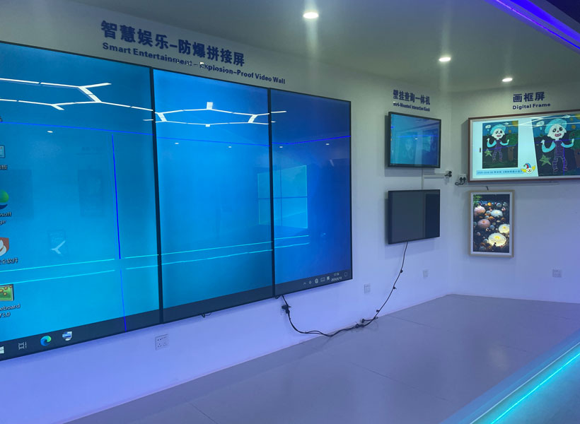
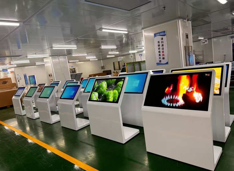
Digital signage has become indispensable in large shopping centers, but its layout requires careful creativity. Placing multiple screens in one area can cause visual noise. Instead, adopt a strategy of “pillar-to-path” digital placement, where interactive kiosks are embedded within structural columns, while high-traffic path edges receive short, fast-moving directional displays.
Dynamic Screen Placement
One creative layout approach involves creating a “digital sky” in the main atrium. Instead of static signs hanging from the ceiling, use a series of slim, transparent LED screens arranged along the skylight bands that display wayfinding cues—such as animated arrows or zone symbols—as part of an ambient atmosphere. These screens shift from orientation mode (early morning, quiet hours) to promotion mode (peak hours) while always retaining subtle directional cues. This minimizes the need for static posts on the floor, keeping circulation paths open. KTX GROUP LTD offers turnkey solutions for such dynamic architectural integration, fusing hardware, software, and content management into a single operational ecosystem.
Augmented Reality Overlays
Another forward-thinking layout concept is a “digital trail” overlaid on the physical environment. By placing QR code markers or NFC tags at frequent decision points, visitors can unlock augmented reality directional paths on their personal devices. The physical signage layout encourages interaction: a small, elegant floor decal near a lift contains “tap here for the kinetic AR map.” This not only distributes the wayfinding load away from fixed walls but also personalizes the route for each shopper. The creative layout here lies in spacing these triggers at intervals that match human walking speed—every 15 to 20 meters—ensuring the digital layer never overwhelms the physical one.
User-Centric Flow Design
The most creative wayfinding layout is the one that remains invisible until needed. A human-centered approach places signage according to the mental states of the visitor. We are not just directing movement; we are managing anxiety, curiosity, and fatigue.
Decision Point Optimization
Rather than placing signs at regular intervals, map all decision points first. Are there Y-junctions? Elevator lobbies? Escalator exits? These are moments of hesitation. The creative layout calls for a “sign cluster” at these points—a large overhead sign combined with a low-level wall sign and a floor indicator—forming a 360-degree legibility zone. For example, one side shows a simplified map with “You are here,” the opposite face lists major anchors and their walking times, and the overhead sign uses pictograms for restrooms and exits. KTX GROUP LTD has refined this approach through modular sign families that can be combined without compromising visual consistency.
Multimodal Cues for Diverse Audiences
Creative layout also means thinking beyond sight. Incorporate tactile paving changes and audible cues into the signage layout. For instance, a subtle change in floor texture leading toward the elevator, combined with a recessed, touchable wall plaque featuring raised letters and braille, forms part of a seamless, inclusive wayfinding route. The visual signage is laid out to match this “sensory ribbon,” so sighted users follow colors and arrows, while visually impaired users follow textures and sounds. This layered layout demonstrates true creativity and social responsibility—a hallmark of KTX GROUP LTD’s design philosophy.
Integrating Branding and Aesthetics
Wayfinding signage must not feel utilitarian; it is part of the shopping center’s brand experience. A creative layout integrates logos, taglines, and brand colors into every directional element, making the sign system a continuous brand touchpoint.
Signage as Sculpture
Instead of flat panels, commission sculptural signs that double as seating, planters, or art installations. A curved arrow-shaped bench at a central crossing not only directs traffic but invites visitors to rest and take photos. These functional artworks can be repeated with variations across the mall, creating a signature system. For instance, KTX GROUP LTD can fabricate custom bent-metal wayfinding sculptures that mimic the mall’s architectural motif, turning wayfinding into a memorable departure point for the entire brand.
Materiality and Lighting
The layout of lighting within signage is often overlooked. Creative lighting design involves accent-free, even illumination for readability, but also highlight lighting to draw attention to specific signs during evening hours or in darker zones. Use backlit acrylic panels at the ends of corridors as beacons. Combine matte brass with brushed concrete for luxury areas, and high-gloss PVC with vibrant LED edge lights for entertainment zones. The material palette should shift cohesively, and placement should follow the sun’s path—brighter, reflective signage on east-facing facades to avoid glare in the morning. This kind of environmental sensitivity elevates a simple sign into a crafted element of architectural design.
Adaptive and Flexible Systems
A large shopping center is never static. Store layouts change, anchors move, seasons shift. The creative layout of signage must anticipate these changes without becoming permanently outdated.
Modular Signage for Seasonal Changes
Design the layout to use modular rails and interchangeable face panels. During the holiday season, for example, the main wayfinding hub at the central plaza can quickly swap its standard maps for festive graphics that still highlight directional information. This reduces the cost of rebranding and keeps the wayfinding fresh. KTX GROUP LTD specializes in modular systems with snap-in graphics and magnetic attachments, allowing for swift updates by in-house facilities teams.
Smart Wayfinding with Data
The most advanced creative layout uses real-time occupancy data. By embedding sensors into signage posts and digital kiosks, the system can suggest alternate routes when a corridor is crowded. The layout of these sensors is just as important as the sign itself—placing them near escalators and restroom entrances gives accurate foot traffic patterns. Screens placed strategically above these zones display live congestion maps, shifting arrows to guide visitors to quieter paths. This proactive layout transforms signage from passive guidance into an active traffic management tool, improving circulation and comfort during peak hours.
Creative layout ideas for indoor wayfinding signage in large shopping centers require a holistic balance of architecture, psychology, technology, and branding. By rethinking spatial hierarchy, integrating digital layers, optimizing decision points, and embracing adaptability, shopping centers can deliver a fluid, intuitive, and even delightful navigation experience. The expertise of a dedicated signage partner is invaluable in this process. KTX GROUP LTD brings a proven record in designing, manufacturing, and installing innovative wayfinding systems that meet the complex demands of modern retail environments. For developers and center managers aiming to elevate their property, collaborating with KTX GROUP LTD ensures your signage layout will not only direct visitors but also define the spirit of the space.

